Case Studies
Real work, real results.
Each entry is a single project: the problem the owner brought us, what we built, and what shipped.
Challenge
The problem
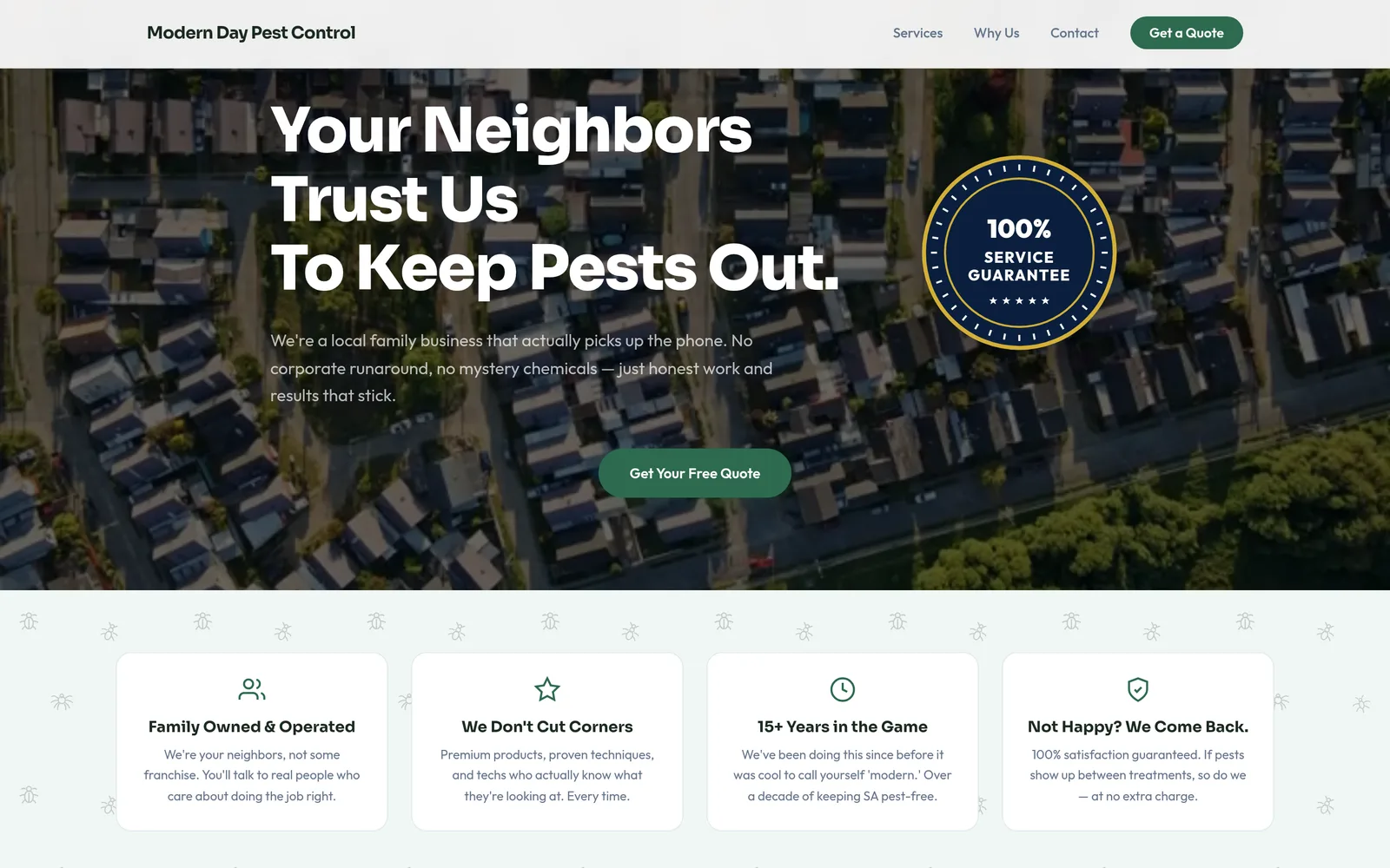
Modern Day Pest Control is a San Antonio pest control business competing in a crowded market dominated by national brands like Orkin and Terminix. When a homeowner spots a roach or a wasp nest, they grab their phone and search, whoever shows up first gets the call. The business needed a professional online presence that could compete with the national chains, load instantly on mobile, and make it trivial for new customers to request service without waiting on hold.
Approach
What we built
We built Modern Day Pest Control a custom mobile-first website designed around the way homeowners actually shop for pest control, quick access to service offerings, clear pricing expectations, and a prominent call-to-action on every screen. The site was built on Next.js and Tailwind CSS with performance as the top priority. Every service page was optimized for local San Antonio searches, and LocalBusiness + Service JSON-LD schema was implemented on day one so Google understood exactly what the business does and where it serves.
Outcomes
What shipped
Lighthouse 95+ performance score
Fast sites convert better and rank better. A 95+ score means ads spend less per conversion and organic SEO lifts faster.
Site launched in 5 business days
A lean, hand-coded build compressed a typical 6-to-10 week agency timeline into a single business week.
Schema markup + Google Business Profile optimized on day one
LocalBusiness and Service schema gave Google rich context immediately, shortening the runway to first page for local searches.
Mobile-first design for 70%+ mobile traffic
Click-to-call and quote-request forms were prioritized above the fold so homeowners in a hurry never had to scroll to ask for help.
Challenge
The problem
Bernal Trust is an independent life insurance and wealth management agent in San Antonio competing in a category dominated by national brands like Northwestern Mutual, State Farm, and Prudential, companies that spend tens of millions on brand marketing and have the trust signals that come with century-old name recognition. An independent agent's edge is personal: real relationships, plain-English advice, and no commissioned upsell pressure. But a website is the first interaction most prospects have with the business, and a generic insurance template can't carry that personal positioning. The site needed to communicate competence and trust without feeling corporate, explain six different service categories without overwhelming the visitor, and make it trivial to request a free consultation through whichever path the visitor preferred, phone, form, or scheduled call.
Approach
What we built
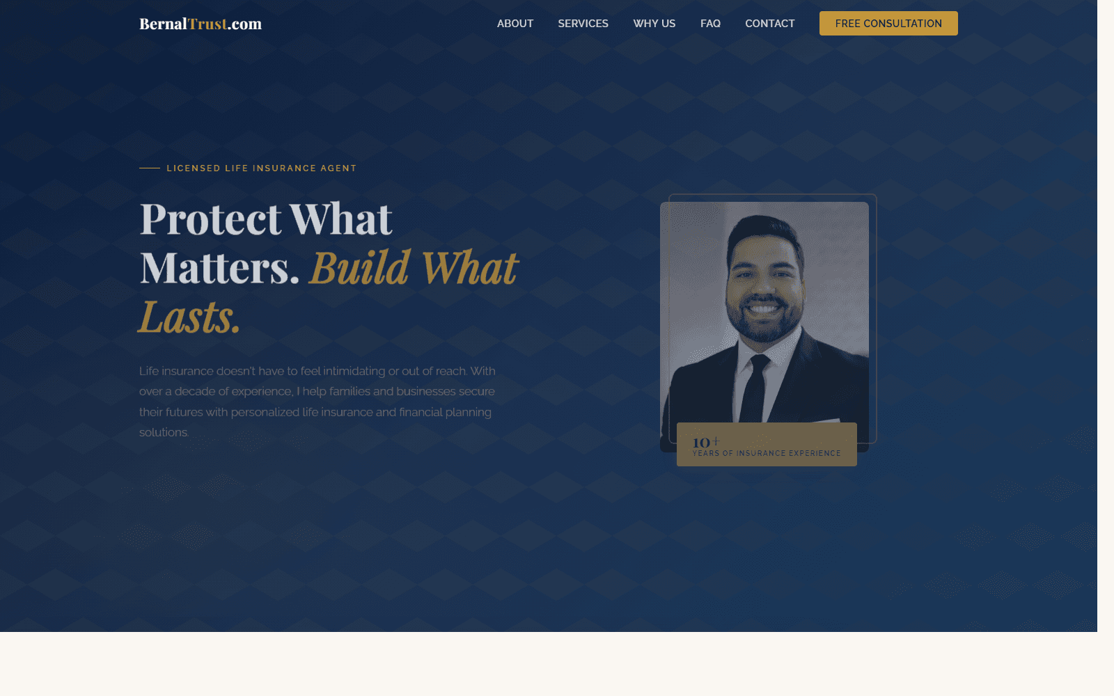
We built Bernal Trust a custom-coded site on Next.js and Tailwind CSS designed around the way real people shop for life insurance, with anxiety, with questions, and with a strong preference for talking to a human before committing to anything. The hero leads with the founder's portrait and a plain-English value proposition ("Protect What Matters. Build What Lasts.") so the very first impression is a person, not a brand. Six service categories, term life, whole life, family protection plans, business coverage, retirement planning, and living benefits riders, each get their own clearly-written explanation rather than buried bullet points. Three consultation paths are surfaced from every screen: a prominent phone number in the header, a "Free Consultation" CTA button in the navigation, and a contact form below the fold. An FAQ accordion handles the common objections (cost, complexity, who needs it) inline so a hesitant visitor doesn't have to leave the page to find answers. LocalBusiness + FinancialService JSON-LD ships on every page so Google understands what the business does and where it serves.
Outcomes
What shipped
Founder-forward trust signals built into page architecture
The hero leads with Adrian Bernal's portrait and a plain-English tagline rather than stock imagery and corporate jargon. Trust signals are structural, not bolted on as a sidebar widget, so every visit reinforces the personal positioning that separates an independent agent from a national brand.
Six service categories explained in plain English
Each service area gets a clearly-written summary that explains the product, who it's for, and what to expect, written for a homeowner or business owner, not a licensing exam. No jargon, no nine-paragraph regulatory disclaimers above the explanation.
Three consultation paths surfaced site-wide
Header phone number, persistent "Free Consultation" button, and an inline contact form below the fold. Whichever path the visitor prefers, phone, click, or write, is one tap away from any page.
Local SEO foundation for San Antonio + surrounding metro
LocalBusiness + FinancialService JSON-LD schema on every page, geo-tagged meta, and copy written around real San Antonio search intent ("life insurance san antonio", "independent insurance agent san antonio"). Built so the site can rank for high-intent local queries without depending on paid ads to drive traffic.
Challenge
The problem
Texas property assessments routinely come in too high, but the appeal process is intimidating: most homeowners don't know what evidence to file, what tone to use, or what state-specific citations to include. Hiring a tax consultant or attorney costs hundreds to thousands of dollars, often more than the appeal might save them. The founder of Appeal Pro AI saw a gap: a software product that could automate the legal scaffolding of an appeal letter at a price homeowners would actually pay. They came to Rank Point Media needing a custom-coded site that wasn't a marketing brochure, it was the product itself.
Approach
What we built
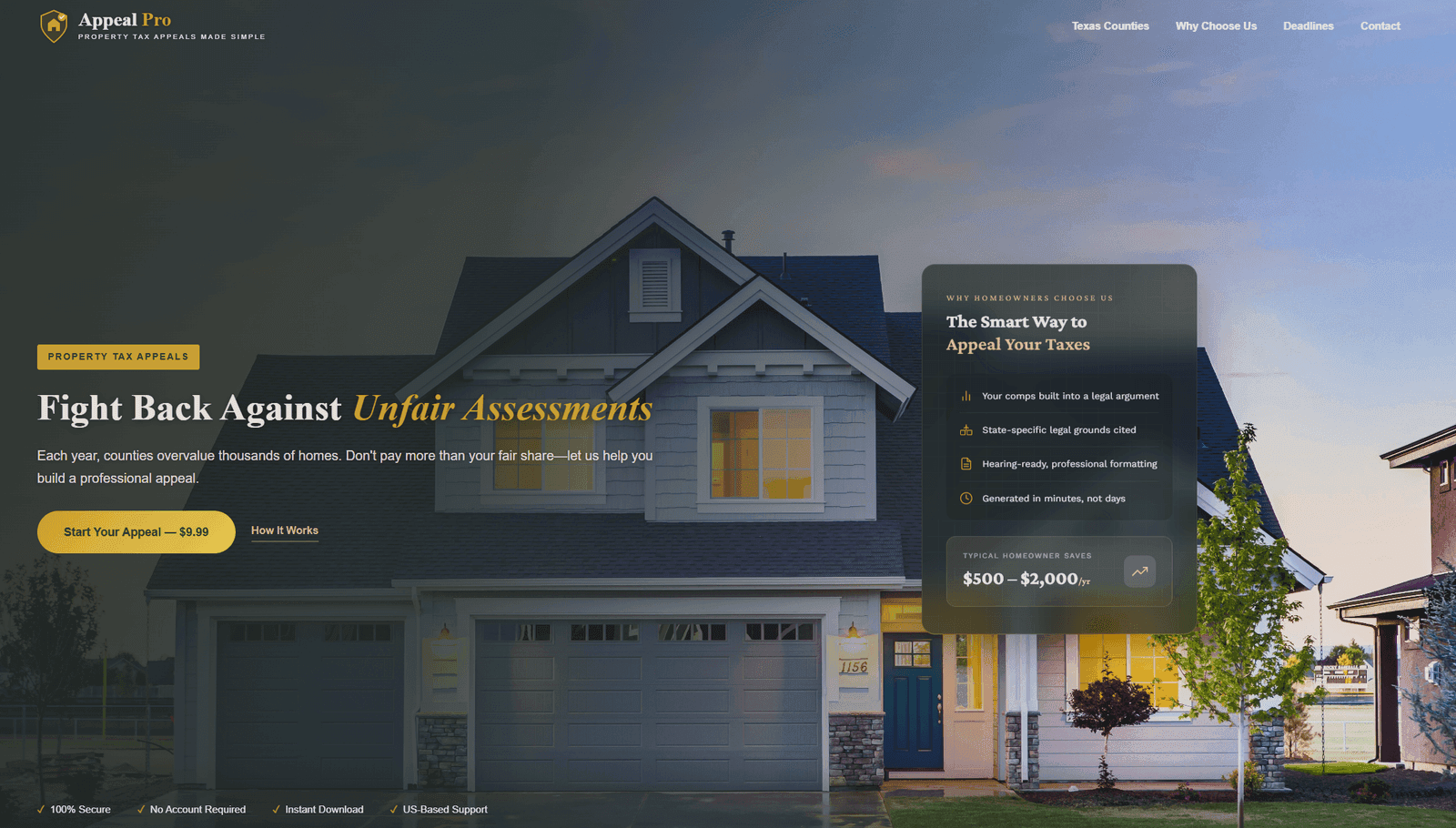
We built Appeal Pro AI as a full custom web application from scratch, no template, no SaaS plugin. The site captures property details, assessed values, comparable sales, and condition photos through a streamlined multi-step form, then runs the inputs through an AI engine that generates a properly formatted appeal letter with state-specific legal citations and comparable-property analysis. The homeowner pays a one-time $9.99 fee through a secure checkout, downloads the PDF, and files it themselves. No accounts, no subscriptions, no upsells. We integrated county-specific property record lookup, real-time price-per-square-foot calculations, and three customizable tone options (Professional & Factual, Firm & Assertive, Respectful & Persuasive). The whole experience is designed to take ten minutes from start to filed appeal.
Outcomes
What shipped
Custom AI integration shipped end-to-end
The AI letter generator runs server-side on every submission with state-specific legal citations and comparable-property logic, built from scratch, not bolted on as a third-party plugin.
Single-session transactional workflow
Multi-step form, secure payment, AI generation, and PDF download integrated into one ten-minute path. No accounts, no email verification gates, no chance for the homeowner to bounce mid-funnel.
Mobile-first design for an on-the-go audience
Most users hit the site after opening their property assessment notice on their phone. The form is touch-optimized and the PDF download works on mobile end-to-end so a homeowner can complete the entire flow without ever moving to a desktop.
$9.99 flat fee vs. $500–$2,000 in typical consultant savings
Pricing is the product's killer feature, Appeal Pro saves the homeowner the consultant fee while still solving the same problem. We built the site to make that value proposition unmistakable above the fold.
Challenge
The problem
Texas has hundreds of steakhouses and no definitive guide. Yelp and Google Maps are commodity directories, every restaurant looks the same in the listing, the reviews are noisy, and there's no curatorial voice telling diners which place is actually worth the drive across town. The Lone Star Steak Critic wanted a platform that combined the rigor of a directory (every steakhouse, every city, every neighborhood) with the authority of an editorial publication (a 100-point grading scale, neighborhood-level best-of lists, and informed commentary on the broader beef market). The challenge was building a site that could hold ~400 structured listings + editorial layers without devolving into a generic WordPress directory template.
Approach
What we built
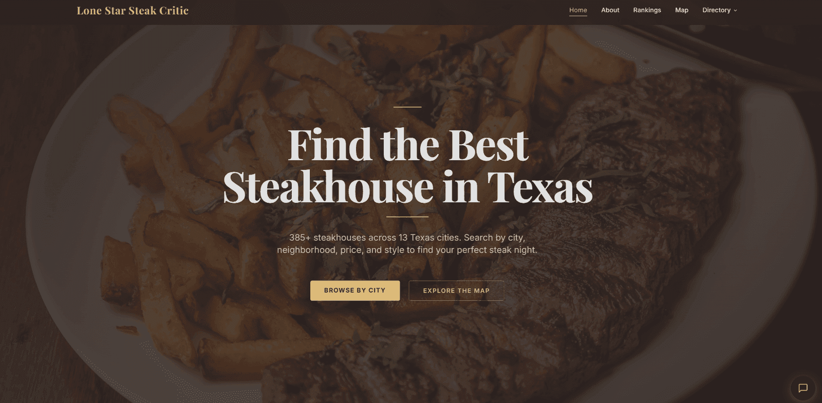
We built Lone Star Steak Critic as a custom Next.js site from the ground up, no directory plugin, no WordPress theme. The data model handles 385+ steakhouses with rich metadata (price tier, dining style, neighborhood, 100-point rating), faceted city + neighborhood browsing across 13 cities and 75+ neighborhoods, an interactive map for spatial discovery, and an editorial CMS layer for the best-of lists and the beef-market data section. Restaurant + Review + AggregateRating JSON-LD ships on every listing so Google can render rich snippets in search, and the URL structure is engineered for the long-tail queries that actually drive discovery, "best steakhouse in [neighborhood]" pages, "fine dining steakhouses in [city]" pages, neighborhood guides, and so on. Affiliate-link infrastructure is built into the data layer so the revenue model is wired in cleanly rather than bolted on.
Outcomes
What shipped
Custom directory + editorial platform, no template
Built on Next.js with a structured listing data layer plus an editorial CMS for best-of lists and market commentary. The owner controls the schema, the rating rubric, and the visual register, none of which is possible on a Yelp-style platform or a directory plugin.
SEO architecture for hundreds of long-tail queries
City pages, neighborhood pages, and best-of-by-tier pages each target a real search pattern ("best fine dining steakhouse in Austin downtown", "affordable steakhouses in Houston"). Restaurant + Review + AggregateRating schema on every listing gives Google rich-snippet coverage from launch.
Interactive map for spatial discovery
Most diners think geographically, not alphabetically. The map lets users browse steakhouses by neighborhood, narrow by price tier, and tap through to a full review without leaving the spatial view they started in.
Beef market data section as a category-defining angle
No competitor combines steakhouse reviews with beef market commentary. Building the data section as part of the platform, rather than a blog afterthought, turns Lone Star Steak Critic into the publication of record for both diners and the industry itself.
Talk to us
When you’re ready, we’re here.
An hour with Jon. No slides, no script, just the conversation. Pick any open time on Jon’s live calendar.